Aspect Ratio
Displays content while maintaining a specified aspect ratio, ensuring consistent visual proportions.
<script lang="ts">
import { AspectRatio } from "bits-ui";
</script>
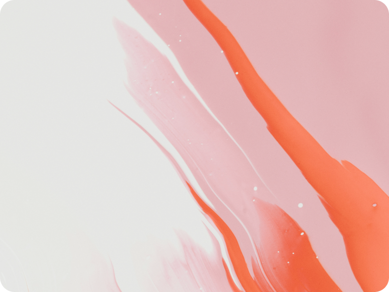
<AspectRatio.Root ratio={14 / 9} class="scale-80 rounded-[15px] bg-transparent">
<img
src="/abstract.png"
alt="an abstract painting"
class="h-full w-full rounded-[15px] object-cover"
/>
</AspectRatio.Root>
	import typography from "@tailwindcss/typography";
	import animate from "tailwindcss-animate";
	import { fontFamily } from "tailwindcss/defaultTheme";

	/** @type {import('tailwindcss').Config} */
	export default {
		darkMode: "class",
		content: ["./src/**/*.{html,js,svelte,ts}"],
		theme: {
			container: {
				center: true,
				screens: {
					"2xl": "1440px",
				},
			},
			extend: {
				colors: {
					border: {
						DEFAULT: "hsl(var(--border-card))",
						input: "hsl(var(--border-input))",
						"input-hover": "hsl(var(--border-input-hover))",
					},
					background: {
						DEFAULT: "hsl(var(--background) / <alpha-value>)",
						alt: "hsl(var(--background-alt) / <alpha-value>)",
					},
					foreground: {
						DEFAULT: "hsl(var(--foreground) / <alpha-value>)",
						alt: "hsl(var(--foreground-alt) / <alpha-value>)",
					},
					muted: {
						DEFAULT: "hsl(var(--muted) / <alpha-value>)",
						foreground: "hsl(var(--muted-foreground))",
					},
					dark: {
						DEFAULT: "hsl(var(--dark) / <alpha-value>)",
						4: "hsl(var(--dark-04))",
						10: "hsl(var(--dark-10))",
						40: "hsl(var(--dark-40))",
					},
					accent: {
						DEFAULT: "hsl(var(--accent) / <alpha-value>)",
						foreground: "hsl(var(--accent-foreground) / <alpha-value>)",
					},
					destructive: {
						DEFAULT: "hsl(var(--destructive) / <alpha-value>)",
					},
					contrast: {
						DEFAULT: "hsl(var(--contrast) / <alpha-value>)",
					},
				},
				fontFamily: {
					sans: ["Inter", ...fontFamily.sans],
					mono: ["Source Code Pro", ...fontFamily.mono],
					alt: ["Courier", ...fontFamily.sans],
				},
				fontSize: {
					xxs: "10px",
				},
				borderWidth: {
					6: "6px",
				},
				borderRadius: {
					card: "16px",
					"card-lg": "20px",
					"card-sm": "10px",
					input: "9px",
					button: "5px",
					"5px": "5px",
					"9px": "9px",
					"10px": "10px",
					"15px": "15px",
				},
				height: {
					input: "3rem",
					"input-sm": "2.5rem",
				},
				boxShadow: {
					mini: "var(--shadow-mini)",
					"mini-inset": "var(--shadow-mini-inset)",
					popover: "var(--shadow-popover)",
					kbd: "var(--shadow-kbd)",
					btn: "var(--shadow-btn)",
					card: "var(--shadow-card)",
					"date-field-focus": "var(--shadow-date-field-focus)",
				},
				opacity: {
					8: "0.08",
				},
				scale: {
					80: ".80",
					98: ".98",
					99: ".99",
				},
			},
			keyframes: {
				"accordion-down": {
					from: { height: "0" },
					to: { height: "var(--bits-accordion-content-height)" },
				},
				"accordion-up": {
					from: { height: "var(--bits-accordion-content-height)" },
					to: { height: "0" },
				},
				"caret-blink": {
					"0%,70%,100%": { opacity: "1" },
					"20%,50%": { opacity: "0" },
				},
			},
			animation: {
				"accordion-down": "accordion-down 0.2s ease-out",
				"accordion-up": "accordion-up 0.2s ease-out",
				"caret-blink": "caret-blink 1.25s ease-out infinite",
			},
		},
		plugins: [typography, animate],
	};
	@import url("https://fonts.googleapis.com/css2?family=Source+Code+Pro:ital,wght@0,400;0,500;0,600;0,700;1,400;1,500;1,600;1,700&display=swap");
@import url("https://fonts.googleapis.com/css2?family=Inter:wght@400;500;600&display=swap");

@tailwind base;
@tailwind components;
@tailwind utilities;

@layer base {
	:root {
		/* Colors */
		--background: 0 0% 100%;
		--background-alt: 0 0% 100%;
		--foreground: 0 0% 9%;
		--foreground-alt: 0 0% 32%;
		--muted: 240 5% 96%;
		--muted-foreground: 0 0% 9% / 0.4;
		--border: 240 6% 10%;
		--border-input: 240 6% 10% / 0.17;
		--border-input-hover: 240 6% 10% / 0.4;
		--border-card: 240 6% 10% / 0.1;
		--dark: 240 6% 10%;
		--dark-10: 240 6% 10% / 0.1;
		--dark-40: 240 6% 10% / 0.4;
		--dark-04: 240 6% 10% / 0.04;
		--accent: 204 94% 94%;
		--accent-foreground: 204 80% 16%;
		--destructive: 347 77% 50%;

		/* black */
		--constrast: 0 0% 0%;

		/* Shadows */
		--shadow-mini: 0px 1px 0px 1px rgba(0, 0, 0, 0.04);
		--shadow-mini-inset: 0px 1px 0px 0px rgba(0, 0, 0, 0.04) inset;
		--shadow-popover: 0px 7px 12px 3px hsla(var(--dark-10));
		--shadow-kbd: 0px 2px 0px 0px rgba(0, 0, 0, 0.07);
		--shadow-btn: 0px 1px 0px 1px rgba(0, 0, 0, 0.03);
		--shadow-card: 0px 2px 0px 1px rgba(0, 0, 0, 0.04);
		--shadow-date-field-focus: 0px 0px 0px 3px rgba(24, 24, 27, 0.17);
	}

	.dark {
		/* Colors */
		--background: 0 0% 5%;
		--background-alt: 0 0% 8%;
		--foreground: 0 0% 95%;
		--foreground-alt: 0 0% 70%;
		--muted: 240 4% 16%;
		--muted-foreground: 0 0% 100% / 0.4;
		--border: 0 0% 96%;
		--border-input: 0 0% 96% / 0.17;
		--border-input-hover: 0 0% 96% / 0.4;
		--border-card: 0 0% 96% / 0.1;
		--dark: 0 0% 96%;
		--dark-40: 0 0% 96% / 0.4;
		--dark-10: 0 0% 96% / 0.1;
		--dark-04: 0 0% 96% / 0.04;
		--accent: 204 90 90%;
		--accent-foreground: 204 94% 94%;
		--destructive: 350 89% 60%;

		/* white */
		--constrast: 0 0% 100%;

		/* Shadows */
		--shadow-mini: 0px 1px 0px 1px rgba(0, 0, 0, 0.3);
		--shadow-mini-inset: 0px 1px 0px 0px rgba(0, 0, 0, 0.5) inset;
		--shadow-popover: 0px 7px 12px 3px hsla(0deg 0% 0% / 30%);
		--shadow-kbd: 0px 2px 0px 0px rgba(255, 255, 255, 0.07);
		--shadow-btn: 0px 1px 0px 1px rgba(0, 0, 0, 0.2);
		--shadow-card: 0px 2px 0px 1px rgba(0, 0, 0, 0.4);
		--shadow-date-field-focus: 0px 0px 0px 3px rgba(244, 244, 245, 0.1);
	}
}

@layer base {
	* {
		@apply border-border;
	}
	html {
		-webkit-text-size-adjust: 100%;
		font-variation-settings: normal;
	}
	body {
		@apply bg-background text-foreground;
		font-feature-settings:
			"rlig" 1,
			"calt" 1;
	}

	/* Mobile tap highlight */
	/* https://developer.mozilla.org/en-US/docs/Web/CSS/-webkit-tap-highlight-color */
	html {
		-webkit-tap-highlight-color: rgba(128, 128, 128, 0.5);
	}
	::selection {
		background: #fdffa4;
		color: black;
	}

	/* === Scrollbars === */

	::-webkit-scrollbar {
		@apply w-2;
		@apply h-2;
	}

	::-webkit-scrollbar-track {
		@apply !bg-transparent;
	}
	::-webkit-scrollbar-thumb {
		@apply rounded-card-lg !bg-dark-10;
	}

	::-webkit-scrollbar-corner {
		background: rgba(0, 0, 0, 0);
	}

	/* Firefox */
	/* https://developer.mozilla.org/en-US/docs/Web/CSS/scrollbar-color#browser_compatibility */

	html {
		scrollbar-color: var(--bg-muted);
	}

	.antialised {
		-webkit-font-smoothing: antialiased;
		-moz-osx-font-smoothing: grayscale;
	}
}

@layer utilities {
	.step {
		counter-increment: step;
	}

	.step:before {
		@apply absolute inline-flex h-9 w-9 items-center justify-center rounded-full border-4 border-background bg-muted text-center -indent-px font-mono text-base font-medium;
		@apply ml-[-50px] mt-[-4px];
		content: counter(step);
	}
}

@layer components {
	*:not(body):not(.focus-override) {
		outline: none !important;
		&:focus-visible {
			@apply focus-visible:outline-none focus-visible:ring-2 focus-visible:ring-foreground focus-visible:ring-offset-2 focus-visible:ring-offset-background;
		}
	}

	.link {
		@apply inline-flex items-center gap-1 rounded-sm font-medium underline underline-offset-4 hover:text-foreground/80 focus-visible:outline-none focus-visible:ring-2 focus-visible:ring-foreground focus-visible:ring-offset-2 focus-visible:ring-offset-background;
	}

	input::-webkit-outer-spin-button,
	input::-webkit-inner-spin-button {
		-webkit-appearance: none;
		margin: 0;
	}

	/* Firefox */
	input[type="number"] {
		-moz-appearance: textfield;
	}
}
Architecture
- Root: The root component which contains the aspect ratio logic
Structure
Here's an overview of how the Aspect Ratio component is structured in code:
	<script lang="ts">
	import { AspectRatio } from "bits-ui";
</script>

<AspectRatio.Root />
Reusable Component
If you plan on using a lot of AspectRatio components throughout your application, you can create a reusable component that combines the AspectRatio.Root and whatever other elements you'd like to render within it. In the following example, we're creating a reusable MyAspectRatio component that takes in a src prop and renders an img element with the src prop.
	<script lang="ts">
	import { AspectRatio, type WithoutChildrenOrChild } from "bits-ui";

	let {
		src,
		alt,
		ref = $bindable(null),
		imageRef = $bindable(null),
		...restProps
	}: WithoutChildrenOrChild<AspectRatio.RootProps> & {
		src: string;
		alt: string;
		imageRef?: HTMLImageElement | null;
	} = $props();
</script>

<AspectRatio.Root {...restProps} bind:ref>
	<img {src} {alt} bind:this={imageRef} />
</AspectRatio.Root>
You can then use the MyAspectRatio component in your application like so:
	<script lang="ts">
	import MyAspectRatio from "$lib/components/MyAspectRatio.svelte";
</script>

<MyAspectRatio src="https://example.com/image.jpg" alt="an abstract painting" ratio={4 / 3} />
Custom Ratio
Use the ratio prop to set a custom aspect ratio for the image.
	<AspectRatio.Root ratio={16 / 9}>
	<!-- ... -->
</AspectRatio.Root>
API Reference
The aspect ratio component.
| Property | Type | Description |
|---|---|---|
ratio | number | The desired aspect ratio. Default: 1 |
ref $bindable | HTMLDivElement | The underlying DOM element being rendered. You can bind to this to get a reference to the element. Default: undefined |
children | Snippet | The children content to render. Default: undefined |
child | Snippet | Use render delegation to render your own element. See Child Snippet docs for more information. Default: undefined |
| Data Attribute | Value | Description |
|---|---|---|
data-aspect-ratio-root | '' | Present on the root element. |